1. Introduction
In other blog-posts we have seen how we can use Stochastic signal analysis techniques for the classification of time-series and signals, and also how we can use the Wavelet Transform for classification and other Machine Learning related tasks.
This blog-post can be seen as an introduction to those blog-posts and explains some of the more fundamental concepts regarding the Fourier Transform which were not discussed previously.
In this blog-post we will see in more detail (than the other posts) how the Fourier Transform can be used to transform a time-series into the frequency domain, what the frequency spectrum means, what the significance of the different peaks in the frequency spectrum are, and how you can go back from the frequency domain to the time-domain.
By ‘leaving out’ some parts of the frequency spectrum before you transform back to the time-domain you can effectively filter out that part. This can be an effective method for separating the noise, or decomposing a time-series into its Trend and Seasonal parts.
According to Fourier analysis, any function no matter how complex can be fully described in terms of its Fourier coefficients, i.e. its frequency spectrum. So once we know how the frequency spectrum looks like, we can also use it to forecast the time-series into the future .
In my experience the best way to learn is by doing something yourself. We will use several time-series datasets and provide the Python code along each step of the way. So by the end of the blog-post you should be able to use stochastic signal analysis techniques for time-series forecasting.
For this blog-post we will use the following Kaggle datasets, so go ahead and download them:
These datasets are representative of the real world and are typical examples a Data Scientist might come across.
[/responsivevoice]
The contents of this blog-post are:
- 1. Introduction
- 1.2 Loading the three datasets
- 2. Introduction into time-series
- 2.1 what does a time-series look like and consist of?
- 2.2 Decomposing a time-series into its components
- 2.2.1 decomposing a time-series into trend and seasonal components using statsmodels
- 2.2.2 decomposing a time-series into trend and seasonal components with SciPy filters.
- 2.2.3 decomposing a time-series into trend and seasonal components with pandas.
- 2.2.4 decomposing a time-series into trend and seasonal using np.polyfit()
- 2.2.5 decomposing a time-series into trend and seasonal components with NumPy.
- 3. Analysing a time-series with Stochastic Signal Analysis techniques
- 3.1 Introduction to the frequency spectrum and FFT
- 3.2 construction of the frequency spectrum from the time-domain
- 3.3 reconstruction of the time-series from the frequency spectrum
- 3.4 reconstruction of the time-series from the frequency spectrum using the inverse Fourier transform
- 3.5 Reconstruction of the time-series from the frequency domain using our own function and filtering out frequencies
- 4. Time-series forecasting with the Fourier transform
- 4.1 Time-series forecasting on the Rossman store sales dataset.
- 4.2 Time-series forecasting on the Carbon emissions dataset.
- 5. Final Notes
All of the code in this blog-post is also available in my GitHub repository in this notebook. I advise you to download that notebook instead of copying from this blog-post because sometimes Python code is distorted by WordPress.
1.2 Loading the three datasets
|
1 2 3 4 5 6 7 8 9 10 11 12 13 14 15 16 17 18 19 20 21 22 23 24 25 26 27 |
import os import numpy as np import pandas as pd import datetime as dt from scipy.signal import savgol_filter import matplotlib.pyplot as plt from matplotlib.font_manager import FontProperties fontP = FontProperties() fontP.set_size('small') df_air = pd.read_csv('./data/AirPassengers.csv', parse_dates=['Month'], date_parser=lambda x: pd.to_datetime(x, format='%Y-%m', errors = 'coerce')) df_air = df_air.set_index('Month') df_rossman = pd.read_csv('./data/rossmann-store-sales/train.csv', parse_dates=['Date'], date_parser=lambda x: pd.to_datetime(x, format='%Y-%m-%d', errors = 'coerce')) df_rossman = df_rossman.dropna(subset=['Store','Date']) df_carbon = pd.read_csv('./data/carbon_emissions.csv', parse_dates=['YYYYMM'], date_parser=lambda x: pd.to_datetime(x, format='%Y%m', errors = 'coerce')) df_carbon['Value'] = pd.to_numeric(df_carbon['Value'] , errors='coerce') df_carbon = df_carbon.dropna(subset=['YYYYMM','Value'], how='any') df_carbon.loc[:,'Description'] = df_carbon['Description'].apply(lambda x: x.split(',')[0].replace(' CO2 Emissions','')) display(df_air.head(2)) display(df_carbon.head(2)) display(df_rossman.head(2)) |
Lets start by loading the three datasets, cleaning them if necessary and quickly visualising how the time-series in the datasets look like.
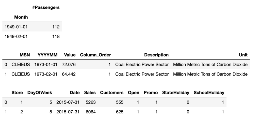
As we can see, the first dataset is relatively simple, containing only a date column and a column with the time-series data.
The second and third dataset contains a date column, but multiple time-series values per date depending on the type of carbon source (indicated in the Description column) or Store number.
|
1 2 3 4 5 6 7 8 9 10 11 12 13 14 15 16 17 18 19 20 21 |
df_rossman_ = df_rossman[df_rossman['Store'] == 1023].sort_values(['Date']) fig, axarr = plt.subplots(figsize=(12,10),nrows=3) df_air['#Passengers'].plot(kind='line', ax=axarr[0]) sns.lineplot(data=df_carbon, x='YYYYMM', y='Value', hue='Description', ax=axarr[1]) sns.lineplot(data=df_rossman_, x='Date', y='Sales', ax=axarr[2]) axarr[1].legend(loc='upper left') axarr[0].set_title('Air Passengers dataset', fontsize=14) axarr[1].set_title('Carbon Emissions dataset', fontsize=14) axarr[2].set_title('Rossman store sales dataset (store 1023)', fontsize=14) axarr[0].set_xlabel('Date', fontsize=14) axarr[1].set_xlabel('Date', fontsize=14) axarr[2].set_xlabel('Date', fontsize=14) axarr[0].set_ylabel('#Passengers', fontsize=14) axarr[1].set_ylabel('Carbon emission', fontsize=14) axarr[2].set_ylabel('Sales', fontsize=14) plt.tight_layout() plt.show() |
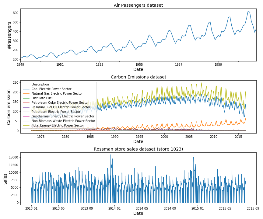
These are the three datasets we will be working with in this blog-post. No need to go into them in detail since they only serve as examples.
2. Introduction into time-series
2.1 what does a time-series look like and consist of?
In Figure 1 above we have already seen how a time-series dataset looks like visually. It is a dataset which is indexed on a time-based axis, meaning the independent variable x indicates the date and/or time and the dependent variable y indicates the value of something at that point in time.
The x-axis consists of equally spaced points in time; it can be one point per year, one point per month, day, minute, second, millisecond, etc.
How frequently spaced these points are, is called the resolution of the dataset. So if a dataset has a second resolution it contains one measurement per second and if it has a millisecond resolution it contains one measurement per 1/1000 of a second.
The resolution is usually pre-determined by the creator of the dataset and depends on factors like the sampling rate of the recording device. For example, for this Kaggle competition the goals was to detect faults in power lines which occur in a very small time-scale. Therefore the signal was recorded with a high sampling-rate of 40 MHz. The final dataset contained signals with 800.000 samples in a period of 20 milliseconds.
Most processes occur on a much larger time-scale, in the time-span of several hours, days or years and it will not be necessary to have such a high resolution.
If the points in time are not equally spaced this means there is some data missing in the dataset. It is always important to check for missing data and interpolate / impute missing points if necessary. During this process you will have to use your own judgement to determine how much missing data is too much. Whether or not it makes sense to interpolate missing data will depend on what the percentage is of the missing data and how the distribution of the missing data looks like. If you’re missing several points but the time-series is very stable you can guess what the missing points will look like, but if the time-series is fluctuating a lot, the interpolation will be a shot in the dark.
Besides the resolution, we should also know what the different components of a time-series dataset are. A time-series consists of:
- trend: this is the large / global upward or downward movement in the time-series over a large period of time. In engineering terms this is also called the DC component of a signal.
- seasonality: this is the short-term seasonal cycle which repeats itself multiple times. It indicates seasonal variances.
Some businesses / processes are highly seasonal while others are not. The more seasonal a process is, the easier it becomes to predict feature behaviour.
In engineering this is also called the AC component of a signal. - noise or irregularity: parts of the time-series which can not be attributed to either the trend of seasonal components and are the result of random variations in the data.
2.2 Decomposing a time-series into its components
When we are modelling or forecasting time-series we are not interested in the trend and noise part of the dataset but we are interested in the seasonal part. This is because the long-term trend often is caused by external factors you can not control or change. (If you are running a store the seasonal cycle might indicate what the sales are each day/week throughout the year(s), while the trend indicates the average increase/decrease due to economic stagnation which happens over multiple years). Also since the global trend and seasonal cycle occur on such different time-scales it is necessary to separate the two in order to model both of them. So let’s see how we can decompose a signal into its trend and seasonal components.
In Python there are many different ways in which we can decompose a time-series signal into its different components. There are some specialised packages like statsmodels you can use, but it is definitely not the only or best way for time-series decomposition. As we will see at the end of this section, the task of time-series decomposition roughly boiles down to subtracting the (rolling) average from the time-series. That is, the trend is calculated with the rolling average of the time-series. This is an simple enough task and it can be done in many other ways:
- As we have said, we can decompose a time-series into trend and seasonality using the statsmodels library.
- We can calculate the trend of a time-series by using SciPy filters.
- We can calculate the trend with the pandas library.
- We can use np.polyfit() to fit a linear / quadratic trend line through the time-series data.
- We can calculate the rolling mean by using only the NumPy library.
2.2.1 decomposing a time-series into trend and seasonal components using statsmodels
Below we will decompose the Air Passengers dataset into its trend component and its seasonal component using the Python package statsmodels.
|
1 2 3 4 5 6 7 8 9 10 11 12 13 14 15 16 |
from statsmodels.tsa.seasonal import seasonal_decompose df_air = df_air.set_index('Month') decomposition = seasonal_decompose(df_air) trend = decomposition.trend seasonal = decomposition.seasonal residual = decomposition.resid fig, ax = plt.subplots(figsize=(8,3)) ax.plot(df_air, label='Original') ax.plot(trend, label='Trend') ax.plot(seasonal, label='Seasonality') ax.plot(residual, label='Residuals') ax.legend(loc='best') ax.set_title('Air Passengers dataset decomposed into Trend and Seasonality') plt.tight_layout() plt.show() |
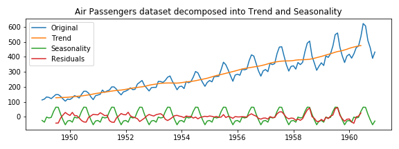
As you can see in Figure 2, we have used the ‘seasonal_decompose‘ method of the statsmodel library to decompose a time-series into its several components. Personally I don’t have much experience with the statsmodels library because I often failed to install it due to conflicting pandas versions or other dependency problems. But I do like that it contains most of the classical time-series forecasting models (ARIMA, SARIMA, etc) for regression, some time-series analysis tools and statistical tests for time-series.
2.2.2 decomposing a time-series into trend and seasonal components with SciPy filters.
The SciPy library contains many filters; low-pass filters, high-pass filters, band-pass filters, butterworth, etc. It is ideal if you are working on a complex problem for which you need a very specific type of filter. You can even design your own filter.
What I often see is that statsmodels is used by people with a statistical background, and SciPy is used by people with an Engineering background.
Having so many options can be overwhelming, so to ease into SciPy filtering, let’s use the savgol_filter. This is one of the more popular filters within SciPy because it is conceptually easy to understand (polynomial smoothing), computationally fast and can be used for a wide range of tasks and datasets. Hence it is ideal if you are only looking to ‘smooth out’ a signal and remove the noise.
|
1 2 3 4 5 6 7 8 9 10 11 12 13 14 |
yvalues = df_air['#Passengers'].values xvalues = df_air.index.values yvalues_f_05_1 = savgol_filter(yvalues,5,1) yvalues_f_15_3 = savgol_filter(yvalues,15,3) yvalues_f_25_1 = savgol_filter(yvalues,25,1) fig, ax = plt.subplots(figsize=(12,3)) ax.plot(df_air.index.values, yvalues, label='#Passengers',linewidth=3) ax.plot(xvalues, yvalues_f_05_1, label='savgol filter (l=5,p=1)', linestyle='--') ax.plot(dxvalues, yvalues_f_25_1, label='savgol filter (l=25,p=1)', linestyle='--') ax.plot(xvalues, yvalues_f_15_3, label='savgol filter (l=5,p=3)', linestyle='--') ax.legend() ax.set_title('Air Passengers dataset, plus Savitzky-Golay filter', fontsize=14) plt.show() |
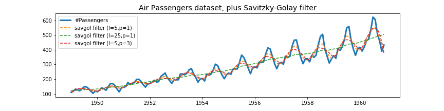
As you can see in Figure 3, the Savitzky-Golay filter contains only two parameters; the window length l and the polynomial order n. Depending on your choice for l and n, the smoothed signal will follow the original signal either very closely or not. If the time-series contains interesting local structures that you do not want to be smoothed out but you still want to remove the noise, you can decrease l and increase n. If you want to capture only the very global trend (as we have done) in your time-series you can increase l and decrease n. To calculate the trend we have chosen a window length l= 25 and a polynomial order n = 1.
In order to get the seasonal component of the time-series dataset, we simply have to subtract the global trend (green dashed line in Figure 3) from the original data.
|
1 2 3 4 5 6 7 8 9 10 11 12 |
yvalues = df_air['#Passengers'].values xvalues = df_air.index.values yvalues_trend = savgol_filter(yvalues,25,1) yvalues_seasonal = yvalues-yvalues_trend fig, ax = plt.subplots(figsize=(12,3)) ax.plot(xvalues, yvalues, label='#Passengers',linewidth=3) ax.plot(xvalues, yvalues_trend, label='Trend') ax.plot(xvalues, yvalues_seasonal, label='Seasonal Component') ax.legend() ax.set_title('Air Passengers dataset decomposed into Trend and Seasonality\n with Savitzky-Golay filter', fontsize=14) plt.show() |
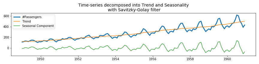
As you can see, the Savitzky-Golay filter is very easy to use.
2.2.3 decomposing a time-series into trend and seasonal components with pandas.
Pandas is one of the best data analysis libraries in Python and has become the standard tool used by almost all Data Scientists. It can do all sorts of data loading tasks, data manipulation and wrangling tasks, is great for working with date time objects, and even plotting the visualisations after your are finished with data wrangling.
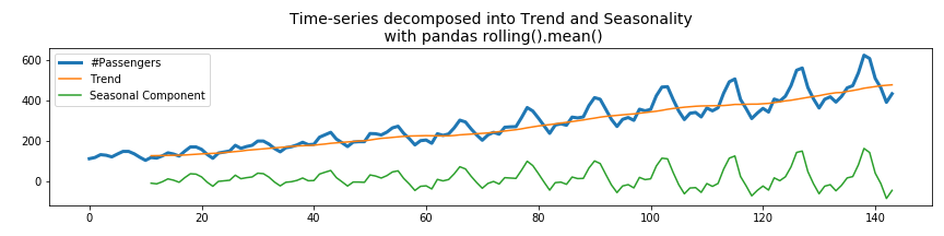
I can imagine, you don’t want to interrupt your workflow (or create a dependency on other libraries like statsmodels / SciPy ) by importing other libraries for a simple task like time-series decomposition. In that case you can also detrend a times-series by calculating the rolling mean with the pandas rolling() function:
|
1 2 3 4 5 6 |
yvalues = df_air['#Passengers'] yvalues_trend = df_air['#Passengers'].rolling(window=12).mean() yvalues_detrended = yvalues - yvalues_trend fig, ax = plt.subplots(figsize=(12,3)) ax.plot(xvalues, yvalues, label='#Passengers',linewidth=3) ax.plot(xvalues, yvalues_trend, label='Trend') ax.plot(xvalues, yvalues_detrended, label='Seasonal Component') ax.legend() ax.set_title('Time-series decomposed into Trend and Seasonality\n with pandas rolling().mean()', fontsize=14) plt.tight_layout() plt.show() |

Calculating the rolling mean using the pandas library works very well. The only disadvantage is that the beginning of the rolling average consists of NaN values. This is because with a window size of 12, there are not enough samples to calculate the mean up to t = 12. You could reduce the number of minimum samples which are necessary with the min_periods parameter. Its default value is equal to the window size.
2.2.4 decomposing a time-series into trend and seasonal using np.polyfit()
We can also use the polynomial fitting functions of Numpy to detrend the time-series. To do this, we need to fit the time-series with a linear polynomial (degree = 1) and subtract this linear trend from the original time-series.
|
1 2 3 4 5 6 7 8 9 10 11 12 13 14 15 16 17 |
yvalues = df_air['#Passengers'] xvalues = range(len(yvalues)) xvalues_extended = range(-10,150) z1 = np.polyfit(xvalues, yvalues, deg=1) p1 = np.poly1d(z1) yvalues_trend = p1(xvalues_extended) yvalues_detrended = yvalues - p1(xvalues) fig, ax = plt.subplots(figsize=(12,3)) ax.plot(xvalues, yvalues, label='#Passengers',linewidth=3) ax.plot(xvalues_extended, yvalues_trend, label='Trend') ax.plot(xvalues, yvalues_detrended, label='Seasonal Component') ax.legend() ax.set_title('Time-series decomposed into Trend and Seasonality\n with np.polyfit()', fontsize=14) plt.tight_layout() plt.show() |
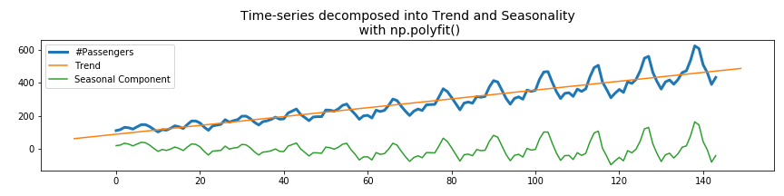
The advantage of this method is that np.polyfit() also returns the values of the polynomial coefficients p(x) = p[0] * x**deg + ... + p[deg], so we do not only decompose the time-series into trend and seasonal components, but we also know by which function the trend is described.
As we will see later in the Carbon emission dataset, the global trend is not always correctly described by a linear function. Then it is also possible to fit it with higher order polynomials (degree 2 or higher).
2.2.5 decomposing a time-series into trend and seasonal components with NumPy.
As we have seen so far, there are a lot of different ways in which you can decompose a signal into its trend and seasonal component. This is because the trend is only the (rolling) average of the signal, where the window size is large enough so that local fluctuations are averaged out.
This is not a difficult thing to do and as we have seen it can be done with a lot of different libraries. Let’s see how we can do this by using NumPy matrix manipulation functions only.
|
1 2 3 4 5 6 7 8 9 10 11 12 13 14 15 16 17 18 19 20 21 |
m = 16 yvalues = df_air['#Passengers'].values xvalues = range(len(yvalues)) yvalues_reshaped = yvalues.reshape(m,-1) yvalues_mean = np.nanmean(yvalues_reshaped, axis=1) xvalues_mean = np.linspace(0,len(yvalues),T) print("Size of original time-series: {} by 1".format(yvalues.shape)) print("Size of reshaped array: {} by {}".format(yvalues_reshaped.shape)) print("Size of reshaped array and averaged array: {} by 1".format(*yvalues_mean.shape)) yvalues_mean_interp = np.interp(xvalues, xvalues_mean, yvalues_mean) yvalues_detrended = yvalues - yvalues_mean_interp fig, ax = plt.subplots(figsize=(12,3)) ax.set_title('Time-series decomposed into Trend and Seasonality\n with numpy', fontsize=14) ax.plot(xvalues, yvalues, label='#Passengers',linewidth=3) ax.plot(xvalues_mean, yvalues_mean, label='Trend') ax.plot(xvalues, yvalues_detrended, label='Seasonal Component') ax.legend() plt.show() |
|
1 2 3 |
*** Size of original time-series: 144 by 1 *** Size of reshaped array: 16 by 9 *** Size of reshaped array and averaged array: 16 by 1 |
What we have done here is, first reshape the time-series from a 1D vector into a 2D matrix. In our case the size of the time-series was 144 by 1 and the reshaped matrix was 16 rows by 9 columns.
Then we calculate the mean value for each of the 16 rows and we end up with a 1D vector with 16 mean values.
As you can see, calculating the average over n points can be as simple as one line of code: np.nanmean(yvalues.reshape(m,-1), axis=1).
In order to subtract this averaged signal of size 16 from the original signal of size 144, we need to interpolate it such that it also contains 144 points.
The only disadvantage of this method is that you need to choose a window length m which is an integer factor of the the original time-series length. So in our case we could have transformed the time-series of length 144 into a matrix of size 24 by 6, 18 by 8, 16 by 9, 12 by 12, 9 by 16, 8 by 18, 6 by 24, etc.
If the window length is not an integer factor of the time-series length, we can also choose to either zero-pad the time-series until its length is a multiple of the chosen window length, or leave out the remainder number of elements from the beginning or end of the time-series.
Personally I like the np.polyfit() method for calculating the trend of a time-series and decomposing the time-series into the trend and seasonal components.
3. Analysing a time-series with Stochastic Signal Analysis techniques
3.1 Introduction to the frequency spectrum and FFT
Stochastic signal analysis techniques are ideal for analysing time-series and forecasting them. The most important one of these techniques is the Fourier transform. The FT transforms a signal from the time-domain to the frequency domain. The frequency spectrum can be used to determine whether the time-series contains any seasonal components, at which frequencies these seasonal components occur and how we can separate them.
Notice how we are talking about seasonal components (multiple) and not seasonal component? A time-series can have multiple seasonal components mixed together in the total signal.
Below, we can see the concept of the time vs the frequency domain visualised. We have five sine-waves (blue signals) with frequencies of 6.5, 5, 3, 1.5 and 1 Hz. By combining these signals we form a new composite signal (black). This signal contains all of the five different seasonal signals. The Fourier Transform transforms this signal from the time-domain to the frequency-domain (red signal) and shows us what the frequencies are of the seasonal signals.
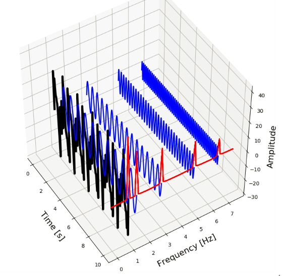
So, two or more different signals (with different frequencies, amplitudes, etc) can be mixed together to form a new composite signal. The composite signal then consists of all of its component signals.
The reverse is also true, every signal – no matter how complex it looks – can be decomposed into a sum of simpler signals. These simpler signals are the trigonometric sine and cosine waves. This is actually what Fourier analysis is all about. The mathematical function which transform a signal from the time-domain to the frequency-domain is called the Fourier Transform, and the function which does the opposite is called the Inverse Fourier Transform.
In order to keep this blog-post concise we will not go into the mathematics of the Fourier transform but only look at how the FT can be applied in practice with Python.
3.2 construction of the frequency spectrum from the time-domain
So how does the frequency spectrum of the Air passenger dataset look like? Lets find out by applying the Fourier transform on our signal.
|
1 2 3 4 5 6 |
yvalues = df_air['#Passengers'].values fft_y = np.fft.fft(yvalues); fig, ax = plt.subplots(figsize=(8,3)) ax.plot(fft_y) ax.set_title('raw FFT values of Air Passengers dataset', fontsize=14) plt.show() |
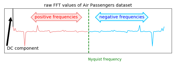
In Figure 8 we can see the result of the FFT applied on the dataset. If you are familiar with frequency spectra you will notice this does not look like a regular one. Actually there are a few things which stand out;
- we can see frequency values with negative amplitudes,
- it looks like the frequency spectrum is mirrored at the center, and everything on the right side (indicated with “negative frequencies”) is a mirror image of the left side (indicated with “positive frequencies”).
- there is a large peak at 0 frequency.
Lets go over these three points one by one:
The reason why we are seeing peaks with negative amplitudes in the frequency spectrum is because the Fourier transform is a measure for the correlation of the cosine at that frequency with the signal. Since a correlation can be negative (indicating a 180 degree phase shift) we can also have negative amplitudes in the frequency spectrum.
How come the frequency spectrum is mirrored at the center? Euler’s identity tells us that the cosine can be written as cos k = 0.5*e^{ik} +0.5*e^{-ik}. For a real valued signal, this becomes cos (2*pi*f*t) = 0.5e^{i*2*pi*f*t} + 0.5e^{-i*2*pi*f*t}, where the first term corresponds with negative and the second term with positive frequencies. Usually the positive frequencies increase up to the Nyquist frequency and after the Nyquist frequency we will see the negative frequencies which are a mirror image (complex conjugated) of the positive ones. This means that if the we have time-series which only contains real-values (which it usually does), the FFT will be perfectly symmetric around the center / nyquist frequency. That is why we are seeing a ‘duplicate’ frequency spectrum mirrored around the center.
The large peak at zero frequency is the DC component in the signal. As we know, the period is inversely proportional to the frequency; T = 1 / f. So, high frequencies f correspond with small periods T and low frequencies with large period values. The lower we go in frequency, the larger the period T becomes. In fact, a frequency f of zero corresponds with a period T of infinite. So if the result of the FFT contains a large peak at zero frequency, this means that we have a component in the signal with an infinite period, i.e. a component which is simply a flat line. This means that we have a bias offset in the signal and the average y-value in our signal is not zero. This is called the DC component of the signal.
If you did not fully understand all of the above, don’t worry. What you need to remember is that in order to have an more interpretable frequency spectrum, we always need to perform the following three steps first:
- first detrend the signal (or subtract the average value from the time-series) in order to remove the large peak at zero frequency,
- then take the absolute value of frequency spectrum in order to make the negative amplitudes positive and
- then only take into account the first half of the frequency spectrum (since the second half is a mirror image).
So lets do that and see how the frequency spectrum of the dataset looks like.
|
1 2 3 4 5 6 7 8 9 10 11 12 13 14 15 16 17 18 19 20 21 22 23 24 25 |
from siml.detect_peaks import * yvalues = df_air['#Passengers'].values yvalues_trend = savgol_filter(yvalues,25,1) yvalues_detrended = yvalues - yvalues_trend fft_y_ = np.fft.fft(yvalues_detrended) fft_y = np.abs(fft_y_[:len(fft_y_)//2]) indices_peaks = detect_peaks(fft_y, mph=430) fft_x_ = np.fft.fftfreq(len(yvalues_detrended)) fft_x = fft_x_[:len(fft_x_)//2] fig, ax = plt.subplots(figsize=(8,3)) ax.plot(fft_x, fft_y) ax.scatter(fft_x[indices_peaks], fft_y[indices_peaks], color='red',marker='D') ax.set_title('frequency spectrum of Air Passengers dataset', fontsize=14) ax.set_ylabel('Amplitude', fontsize=14) ax.set_xlabel('Frequency [1/month]', fontsize=14) for idx in indices_peaks: x,y = fft_x[idx], fft_y[idx] text = " f = {:.2f}".format(x,y) ax.annotate(text, (x,y)) plt.show() |
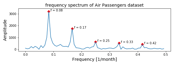
In Figure 9 we can see the absolute, positive frequency values of the detrended time-series.
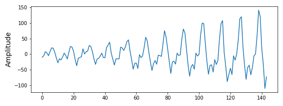
This frequency spectrum looks much better and more like a frequency spectrum we are used to. There are several peaks in the frequency spectrum; at f = 0.08, 0.17, 0.25, 0.33 and 0.42. These frequencies correspond with a period ( T = 1 / f) of 12.5, 5.9, 4.0, 3.0, and 2.4 months. Meaning there is a seasonal components which occurs every year, every 6 months and every quarter!
Since the time-series is about the number of airplane passenger, these seasonal components in the dataset are what we already expected.
3.3 reconstruction of the time-series from the frequency spectrum
According to Fourier analysis, no matter how complex a signal is, it can be fully described by its frequency spectrum. Meaning that we should be able to fully reconstruct the original time-series signal once we know how the frequency spectrum looks like. Lets try to see if we can do that using the information we have from the frequency spectrum of the Air passenger dataset.
|
1 2 3 4 5 6 7 8 9 10 11 12 13 14 15 16 17 18 19 20 21 22 |
t_n, N = 144, 1000 peak_freqs = fft_x[indices_peaks] peak_amplitudes = fft_y[indices_peaks] x_value = np.linspace(0,t_n,N) y_values = [peak_amplitudes[ii]*<em>np.sin(2</em>*np.pi*<em>peak_freqs[ii]</em>*x_value) for ii in range(0,len(peak_amplitudes))] composite_y_value = np.sum(y_values, axis=0) fig, axarr = plt.subplots(figsize=(8,8),nrows=3) axarr[0].plot(xvalues,yvalues_detrended) for ii in range(len(peak_amplitudes)): freq=peak_freqs[ii] A = peak_amplitudes[ii] y_value = A<em>np.sin(2</em>np.pi<em>freq</em>x_value) axarr[1].plot(x_value, y_value,label='freq {:.2f}'.format(freq)) axarr[1].legend() axarr[2].plot(x_value, composite_y_value) axarr[0].set_title('detrended Air Passenger dataset', fontsize=14) axarr[1].set_title('sine waves at the peak frequency values', fontsize=14) axarr[2].set_title('composite signal of all sine waves', fontsize=14) plt.tight_layout() plt.show() |
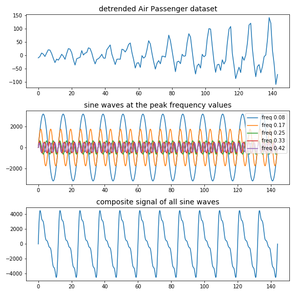
In Figure 10 we can see in the top figure the original detrended air passenger time-series, in the middle figure the five different sine waveforms with frequencies equal to the five peaks, and in the bottom figure the composite sine wave constructed by adding all of the five sine waves.
Although the composite signal looks similar to our original time-series and has the correct period, it does not have the same shape and something is off. The reason for this is very simple; we have only used the five peak frequency values and not the entire frequency spectrum. This differences between what we have used and what we should have used is shown in Figure 11
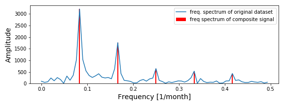
What I mean is that a peak in a frequency spectrum does not only have a frequency value and an amplitude, but also a width*. The sharper a peak is, i.e. the higher and thinner it is compared to the ground level, the more present that frequency is in the time-series. The broader a peak is, the more ‘noise’ is present in the signal surrounding that frequency. Since the Air passenger dataset is a very simple one, the frequency spectrum looks very clean. In other datasets you will often see much more noise and peaks which barely exceed the noise level.
*The technical way to measure the width of a peak is the Full width at half-maximum (FWHM), which measures the width of the peak at half of the maximum of the amplitude.
3.4 reconstruction of the time-series from the frequency spectrum using the inverse Fourier transform
So if that is not the proper way to reconstruct a signal from the frequency spectrum, how should it be done then? We can use the inverse Fourier transform:
|
1 2 3 4 5 6 7 8 |
fft_y_ = np.fft.fft(yvalues_detrended) inverse_fft = np.fft.ifft(fft_y_) fig, ax = plt.subplots(figsize=(8,3)) ax.plot(inverse_fft, label='The inverse of the freq. spectrum') ax.set_ylabel('Amplitude', fontsize=14) plt.tight_layout() plt.show() |
As we can see in Figure 12, the inverse of the frequency spectrum does exactly look like the original time-series. So the right way to do it is to take the whole frequency spectrum into account.
Since the frequency is inversely proportional to the period, the lower part of the frequency spectrum is usually more interesting than the higher frequency values. Low frequencies corresponds with large periods and interesting seasonal effects. High frequencies correspond with very small periods indicating local fluctuations; these are often the result of noise and not interesting.
So, if we are able to remove the higher frequency values from the frequency spectrum and then transform it back, we should be able to remove noise from a time-series.
|
1 2 3 4 5 6 7 8 9 10 11 12 13 14 15 16 17 18 19 20 21 22 23 24 25 26 27 |
fig, axarr = plt.subplots(figsize=(12,8), nrows=2) axarr[0].plot(fft_x, fft_y, linewidth=2, label='full spectrum') axarr[0].plot(fft_x[:17], fft_y[:17], label='first peak') axarr[0].plot(fft_x[21:29], fft_y[21:29], label='second peak') axarr[0].plot(fft_x[35:], fft_y[35:], label='remaining peaks') axarr[0].legend(loc='upper left') fft_y_copy1 = fft_y_.copy() fft_y_copy2 = fft_y_.copy() fft_y_copy3 = fft_y_.copy() fft_y_copy1[17:-17] = 0 fft_y_copy2[:21] = 0 fft_y_copy2[29:-29] = 0 fft_y_copy2[-21:] = 0 fft_y_copy3[:35] = 0 fft_y_copy3[-35:] = 0 inverse_fft = np.fft.ifft(fft_y_) inverse_fft1 = np.fft.ifft(fft_y_copy1) inverse_fft2 = np.fft.ifft(fft_y_copy2) inverse_fft3 = np.fft.ifft(fft_y_copy3) axarr[1].plot(inverse_fft, label='inverse of full spectrum') axarr[1].plot(inverse_fft1, label='inverse of 1st peak') axarr[1].plot(inverse_fft2, label='inverse of 2nd peak') axarr[1].plot(inverse_fft3, label='inverse of remaining peaks') axarr[1].legend(loc='upper left') plt.show() |
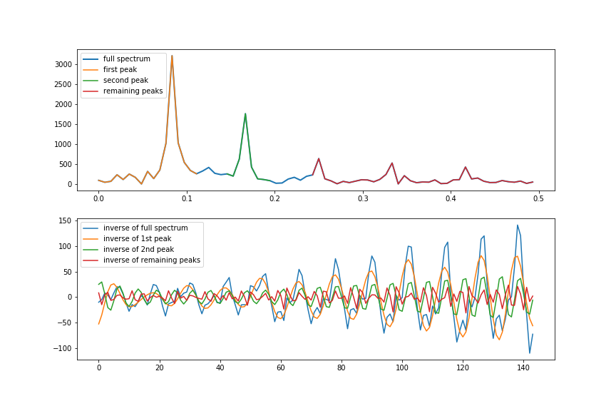
In Figure 13 we can see in the top figure the full frequency spectrum indicated with the blue line and three variants which only contain specific parts of the frequency spectrum.
- For the yellow line, everything after the first peak has been set to zero.
- For the green line everything before the second peak and after the second peak has been set to zero.
- For the red line everything before the third peak has been set to zero.
In the bottom figure we can see what happens if we take the inverse Fourier transform of these four frequency spectra*. As you can see, the first peak which corresponds with a period of 1 year, is the largest contributor to the seasonality in the time-series.
The second peak which corresponds with a period of 6 months, contributes in a smaller amount to the seasonality in the time-series.
For the remaining peaks it is not exactly clear if they are the result of quarterly fluctuations in the time-series or some source of noise.
*I want to note here that, even though we plot the absolute, real part of the frequency spectrum (see figure 8 vs 9), the inverse Fourier transform should always be applied on the full frequency spectrum. As you can see, we are setting parts of fft_y_ to zero and not parts of fft_y. Above Figure 9 you can see that fft_y_ contains the full frequency spectrum while fft_y only contains the positive, real part of the frequency spectrum.
3.5 Reconstruction of the time-series from the frequency domain using our own function and filtering out frequencies
In the previous section we have seen how we can restore the time-series from the frequency domain using the inverse Fourier transform. During this process we have set some parts of the frequency domain to zero so that those frequencies are essentially filtered out from the time-series.
The reason for wanting to do this is that the higher frequencies in the frequency spectrum correspond with fluctuations on a small time scale (noise) which you want to remove from the time-series.
However, the way in which we have done this looks a bit ‘clumsy’ and laborious in my opinion. Is it possible to do it in a better fashion? Lets construct a function which can leave out some fraction of the harmonics (frequencies) when reconstructing the time-series from the frequency domain.
|
1 2 3 4 5 6 7 8 9 10 11 12 13 14 |
def restore_signal_from_fft(fft_x, fft_y, N, frac_harmonics=1.0): xvalues_full = np.arange(0,N) restored_sig = np.zeros(N) indices = list(range(N)) indices.sort(key = lambda z: np.absolute(fft_x[z])) max_no_harmonics = len(fft_y) no_harmonics = int(frac_harmonics*max_no_harmonics) for ii in indices[:1 + no_harmonics*2]: ampli = np.absolute(fft_y[ii]) / N phase = np.angle(fft_y[ii]) restored_sig += ampli * np.cos(2 * np.pi * fft_x[ii] * xvalues_full + phase) return restored_sig |
As you can see we have a function restore_signal_from_fft() which does not use np.fft.ifft() for restoring the time-series, but creates the time-series by adding cosine functions with frequencies calculated with the FFT. The restored signal is the same as the one calculated with the ifft(). The main difference is that this function the parameter frac_harmonics which can be used to include only a fraction instead of all harmonics.
To show what happens when we take less harmonics into account during reconstruction, let’s use this function on the Air passenger dataset and use 5%, 10%, 20% and 100% of the harmonic during the reconstruction process.
|
1 2 3 4 5 6 7 8 9 10 11 12 13 14 15 16 |
yvalues = df_air['#Passengers'].values xvalues = np.arange(len(yvalues)) yvalues = df_air['#Passengers'].values xvalues = np.arange(len(yvalues)) fig, ax = plt.subplots(figsize=(12,4)) ax.plot(yvalues, linewidth=2, label='original time-series') list_frac_harmonics = [0.05, 0.1, 0.2, 1.0] for ii, frac_harmonic in enumerate(list_frac_harmonics): yvalues_restored = reconstruct_from_fft(yvalues, frac_harmonics=frac_harmonic) label = 'restored signal ({:.0f}% harmonics)'.format(100*frac_harmonic) ax.plot(yvalues_restored, label=label) ax.legend(loc='upper left') ax.set_title('Air passenger time-series and several reconstructed versions', fontsize=16) plt.show() |
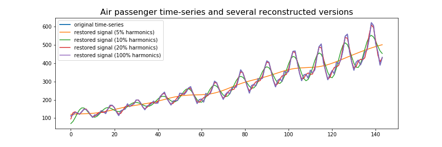
In Figure 14 we can see the result of our function reconstruct_from_fft() where we have varied the number of harmonics to be used during reconstruction. If we include all of the harmonics available in the frequency spectrum during reconstruction, the reconstructed time-series will look exactly like the original time-series. If we include less harmonics in the reconstruction process, the reconstructed time-series will be more ‘smooth’. By including less and less harmonics the reconstructed time-series looks more and more like a trend line than the actual time-series dataset.
In this example it becomes clear why you would want to use less harmonics than is available. If the reconstructed time-series is exactly similar to the original time-series, this means it will also include all of the noise and local fluctuations present in the original time-series. By using a fraction of the harmonics you are effectively filtering out that part of the time-series.
4. Time-series forecasting with the Fourier transform
We have come quite a long way since the beginning of the blog-post. To give a brief recap, we have learned that we first should detrend a time-series before applying the Fourier transform, we have learned how construct the frequency spectrum from the time-domain, how to reconstruct the time-series from the frequency-domain, how to reconstruct the time-series from specific parts of the frequency domain.
How about we make a function that is a bit more versatile and incorporates everything we have learned so far:
- it should first detrend the time-series before calculating the FFT.
- we should be able to detrend it with a linear function, or higher orders if necessary.
- it should also be able to reconstruct the original time-series from the frequency spectrum
- we should be able to determine how many harmonics we want to use in the reconstruction. This way we can remove the higher part of the frequency spectrum if we want to.
- it should be able to extend the reconstructed time-series into the future, i.e. extrapolate it.
|
1 2 3 4 5 6 7 8 9 10 11 12 13 14 15 16 17 18 19 20 21 22 23 24 25 26 27 28 29 30 31 32 33 34 35 36 37 38 39 40 41 42 43 44 45 46 47 48 49 50 51 52 53 54 55 56 57 58 59 60 61 62 63 64 65 66 67 68 69 70 |
def construct_fft(yvalues, deg_polyfit=1, real_abs_only=True): N = len(yvalues) xvalues = np.arange(N) # we calculate the trendline and detrended signal with polyfit z2 = np.polyfit(xvalues, yvalues, deg_polyfit) p2 = np.poly1d(z2) yvalues_trend = p2(xvalues) yvalues_detrended = yvalues - yvalues_trend # The fourier transform and the corresponding frequencies fft_y = np.fft.fft(yvalues_detrended) fft_x = np.fft.fftfreq(N) if real_abs_only: fft_x = fft_x[:len(fft_x)//2] fft_y = np.abs(fft_y[:len(fft_y)//2]) return fft_x, fft_y, p2 def get_integer_no_of_periods(yvalues, fft_x, fft_y, frac=1.0, mph=0.4): N = len(yvalues) fft_y_real = np.abs(fft_y[:len(fft_y)//2]) fft_x_real = fft_x[:len(fft_x)//2] mph = np.nanmax(fft_y_real)*mph indices_peaks = detect_peaks(fft_y_real, mph=mph) peak_fft_x = fft_x_real[indices_peaks] main_peak_x = peak_fft_x[0] T = int(1/main_peak_x) no_integer_periods_all = N//T no_integer_periods_frac = int(frac*no_integer_periods_all) no_samples = T*no_integer_periods_frac yvalues_ = yvalues[-no_samples:] xvalues_ = np.arange(len(yvalues)) return xvalues_, yvalues_ def restore_signal_from_fft(fft_x, fft_y, N, extrapolate_with, frac_harmonics): xvalues_full = np.arange(0, N + extrapolate_with) restored_sig = np.zeros(N + extrapolate_with) indices = list(range(N)) # The number of harmonics we want to include in the reconstruction indices.sort(key = lambda i: np.absolute(fft_x[i])) max_no_harmonics = len(fft_y) no_harmonics = int(frac_harmonics*max_no_harmonics) for i in indices[:1 + no_harmonics * 2]: ampli = np.absolute(fft_y[i]) / N phase = np.angle(fft_y[i]) restored_sig += ampli * np.cos(2 * np.pi * fft_x[i] * xvalues_full + phase) # return the restored signal plus the previously calculated trend return restored_sig def reconstruct_from_fft(yvalues, frac_harmonics=1.0, deg_polyfit=2, extrapolate_with=0, fraction_signal = 1.0, mph = 0.4): N_original = len(yvalues) fft_x, fft_y, p2 = construct_fft(yvalues, deg_polyfit, real_abs_only=False) xvalues, yvalues = get_integer_no_of_periods(yvalues, fft_x, fft_y, frac=fraction_signal, mph=mph) fft_x, fft_y, p2 = construct_fft(yvalues, deg_polyfit, real_abs_only=False) N = len(yvalues) xvalues_full = np.arange(0, N + extrapolate_with) restored_sig = restore_signal_from_fft(fft_x, fft_y, N, extrapolate_with, frac_harmonics) restored_sig = restored_sig + p2(xvalues_full) return restored_sig[-extrapolate_with:] |
As you can see we have a function called reconstruct_from_fft which takes a few arguments:
- yvalues: the actual time-series data
- frac_harmonics: The number of harmonics to be used in the reconstruction, expressed as a percentage between 0.0 and 1.0.
- deg_polyfit: the degree of the polynomial fit used in detrending the signal. Default value is set to 1.
- extrapolate_with: the number of samples we want to extrapolate into the future during reconstruction. That is, if we want to extrapolate. Default value is set to 0.
- fraction_signal: A fraction indicating how much of the signal should be used for calculating the frequency spectrum. For example, if we want to use only the last 20% of the time-series to calculate the frequency spectrum this number should be set to 0.2. The default value is 1.0, so by default the entire time-series is used. The reason for introducing the number is because the spectral contents of the time-series could change and later in the time-series the frequency spectrum could be different.
- mph: the maximum peak height that should be used for detecting peaks in the frequency spectrum (as a percentage of maximum value).
We can also see that there is a separate function called construct_fft() which first detrends the signal and construct the FFT. The reason why this is a separate function is because the frequency spectrum is calculated two times. First we calculate the frequency spectrum in order to determine the frequency value of the main resonance. This is then used to determine the number of samples one period corresponds with so that we can take an integer factor of this number and leave out the remainder number of samples. The frequency spectrum is calculated again over this slightly shorter time-series.
Of course you could also choose to calculate the frequency spectrum only one time and not concern yourself with only taking integer multiples of the period into account. Then you could comment out the second and third line of the reconstruct_from_fft() function.
Lets see how this functions works by using it on the Rossman store sales dataset and the Carbon emission dataset.
4.1 Time-series forecasting on the Rossman store sales dataset.
Lets put this function into use and forecast the Rossman store sales dataset.
|
1 2 3 4 5 6 7 8 9 10 11 12 13 |
df_rossman = pd.read_csv('./data/rossmann-store-sales/train.csv', parse_dates=['Date'], date_parser=lambda x: pd.to_datetime(x, format='%Y-%m-%d', errors = 'coerce')) df_rossman = df_rossman.dropna(subset=['Store','Date']) df = df_rossman df_ = df[df['Store'] == 1023].sort_values(['Date']) df_.loc[:,'Date'] = df_['Date'].apply(lambda x: dt.datetime.strptime(str(x)[:10], '%Y-%m-%d')) fig, ax = plt.subplots(figsize=(12,2)) ax.plot(df_['Date'], df_['Sales'].values) ax.set_title('Rossman Store Sales dataset [store 1023]', fontsize=14) plt.tight_layout() plt.show() |
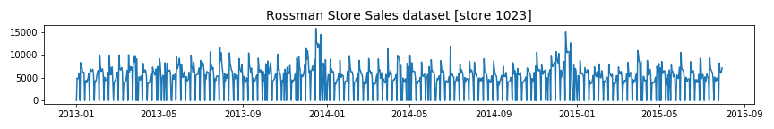
As you can see in the figure above, this dataset is highly seasonal and hence a perfect candidate to try our forecasting method on.
|
1 2 3 4 5 6 7 8 9 10 11 12 13 14 15 16 17 18 19 20 21 22 23 24 25 26 27 28 29 30 31 32 33 34 35 36 37 38 39 40 41 42 43 44 45 46 47 48 49 50 51 52 53 54 55 56 57 58 59 60 61 62 63 64 65 66 67 68 69 70 71 72 73 74 75 |
def plot_yvalues(ax, xvalues, yvalues, plot_original=True, polydeg=2): z2 = np.polyfit(xvalues, yvalues, polydeg) p2 = np.poly1d(z2) yvalues_trend = p2(xvalues) yvalues_detrended = yvalues - yvalues_trend ax.plot(xvalues, yvalues_detrended, color='green', label='detrended') ax.plot(xvalues, yvalues_trend, linestyle='--', color='k', label='trend') if plot_original: ax.plot(xvalues, yvalues, color='skyblue',label='original') ax.legend(loc='upper left', bbox_to_anchor=(-0.09, 1.078),framealpha=1) ax.set_yticks([]) return yvalues_detrended def plot_fft_psd(ax, yvalues_detrended, plot_psd=True, annotate_peaks=True, max_peak=0.5): assert max_peak > 0 and max_peak <= 1, "max_peak should be between 0 and 1" fft_x_ = np.fft.fftfreq(len(yvalues_detrended)) fft_y_ = np.fft.fft(yvalues_detrended); fft_x = fft_x_[:len(fft_x_)//2] fft_y = np.abs(fft_y_[:len(fft_y_)//2]) psd_x, psd_y = welch(yvalues_detrended) mph = np.nanmax(fft_y)*max_peak indices_peaks = detect_peaks(fft_y, mph=mph) peak_fft_x, peak_fft_y = fft_x[indices_peaks], fft_y[indices_peaks] ax.plot(fft_x, fft_y, label='FFT') if plot_psd: axb = ax.twinx() axb.plot(psd_x, psd_y, color='red',linestyle='--', label='PSD') if annotate_peaks: for ii in range(len(indices_peaks)): x, y = peak_fft_x[ii], peak_fft_y[ii] T = 1/x text = " f = {:.2f}\n T = {:.2f}".format(x,T) ax.annotate(text, (x,y),va='top') lines, labels = ax.get_legend_handles_labels() linesb, labelsb = axb.get_legend_handles_labels() ax.legend(lines + linesb, labels + labelsb, loc='upper left') ax.set_yticks([]) axb.set_yticks([]) return fft_x_, fft_y_ list_stores = df_rossman['Store'].value_counts().index.values N = 843 nrows=5 fig, axarr = plt.subplots(figsize=(18,2*nrows), ncols=3, nrows=nrows) for row_no, store in enumerate(list_stores[:nrows]): df_ = df_rossman[df_rossman['Store']==store].sort_values(['Date']) yvalues_full = df_['Sales'].values xvalues_full = np.arange(len(yvalues_full)) yvalues_known = yvalues_full[:N] xvalues_known = np.arange(len(yvalues_known)) yvalues_future = yvalues_full[N:] xvalues_future = np.arange(N, len(xvalues_full)) N_extrapolation = len(yvalues_future) yvalues_detrended = plot_yvalues(axarr[row_no, 0], xvalues_full, yvalues_full, plot_original=False, polydeg=2) fft_x_, fft_y_ = plot_fft_psd(axarr[row_no, 1], yvalues_detrended, plot_psd=True, max_peak=0.4) yvalues_predicted1 = reconstruct_from_fft(yvalues_known, extrapolate_with=N_extrapolation, fraction_signal=0.6) yvalues_predicted2 = reconstruct_from_fft(yvalues_known, extrapolate_with=N_extrapolation, fraction_signal=0.6, frac_harmonics=0.3) axarr[row_no,2].plot(xvalues_future, yvalues_future, label='true yvalues', linewidth=2) axarr[row_no,2].plot(xvalues_future, yvalues_predicted1, label='pred (all harmonics)') axarr[row_no,2].plot(xvalues_future, yvalues_predicted2, label='pred (30% harmonics)') axarr[row_no,0].set_title('known time-series for {}'.format(title),fontsize=10) axarr[row_no,1].set_title('frequency spectrum of {}'.format(title),fontsize=10) axarr[row_no,2].set_title('predicted future for {}'.format(title),fontsize=10) axarr[row_no,2].set_yticks([]) axarr[row_no,2].legend(loc='upper left', bbox_to_anchor=(1.01, 1.078)) plt.tight_layout() plt.show() |
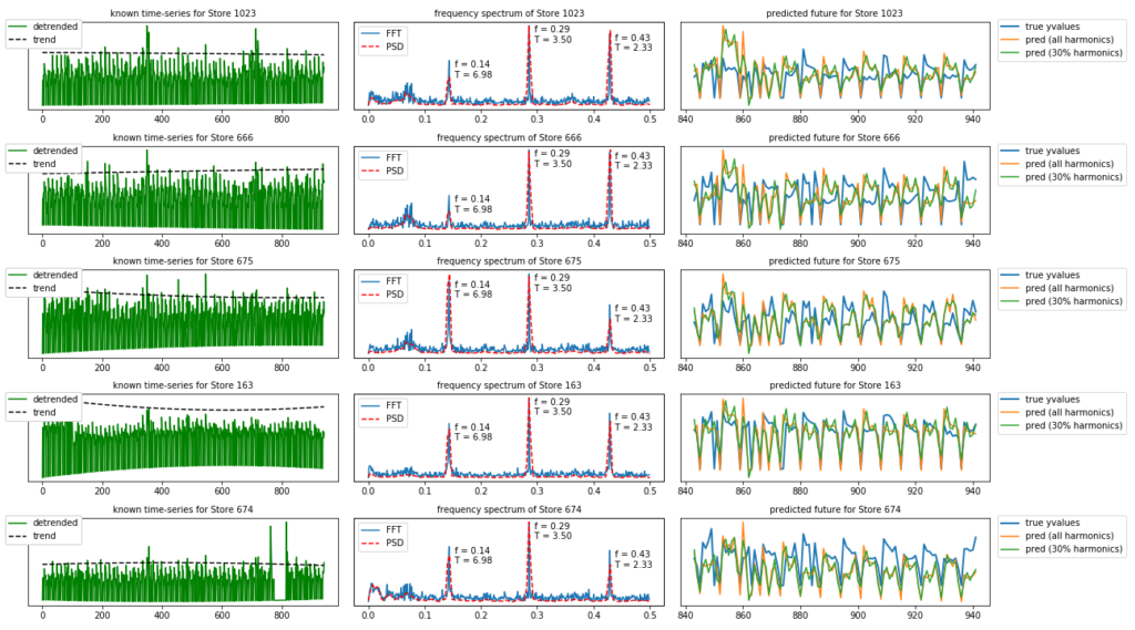
As you can see, what we have done here is for the top 5 stores in the Rossman dataset split the dataset into two parts. The first N samples are the ‘known’ part of the dataset while everything from N up to the end is the ‘unknown’ future.
In the left figure we have plotted the detrended known part of the time-series.
In the middle figures we can see the frequency spectrum (FFT) of these time-series together with the Power Spectral Density (PSD). The difference between the FFT and the PSD is that the FFT is an amplitude spectrum while the PSD is a power spectrum. The power is the square of the amplitude ( P = A^2 ) . We know that the square of a small number ( < 1 ) becomes even smaller, and a big number even bigger, so in the PSD small amplitudes resulting from noise become even smaller. That is not the only difference though. We have used the welch method for calculating the PSD; this method divides the data into overlapping segments and computes a modified periodogram for each segment and averages the periodograms. This contributes to the power spectrum looking cleaner (but also means there are less samples in the PSD than the FFT).
In the right figures we can see the extrapolated part of the time-series. We have extrapolated into the future from N up to the end of the time-series ( N_extrapolate number of samples). This is done two times. The first time we extrapolated into the future using all of the harmonics, and the second time we have used only 30% of the harmonics in the frequency spectrum. As we have seen before, this results in a reconstructed signal which is more ‘smooth’.
The result is actually quiet good. That is because the Rossman store sales is a highly seasonal dataset.
4.2 Time-series forecasting on the Carbon emissions dataset.
Lets do time-series forecasting for the Carbon emissions dataset. This dataset contains different types of time-series; time-series which are highly seasonal or less seasonal, time-series which are more noisy or more ‘clean’.
|
1 2 3 4 5 6 7 8 9 10 11 12 13 14 15 16 17 18 19 20 21 22 23 24 25 26 27 28 29 30 31 32 33 34 35 36 37 38 39 40 41 42 43 44 45 46 47 48 49 50 51 52 53 54 55 |
source_types = [ 'Coal Electric Power Sector', 'Natural Gas Electric Power Sector', 'Distillate Fuel', 'Petroleum Coke Electric Power Sector', 'Residual Fuel Oil Electric Power Sector', 'Petroleum Electric Power Sector', 'Total Energy Electric Power Sector' ] from scipy.signal import welch def signaltonoise(a, axis=0, ddof=0): a = np.asanyarray(a) m = a.mean(axis) sd = a.std(axis=axis, ddof=ddof) return np.where(sd == 0, 0, m/sd) fig, axarr = plt.subplots(figsize=(12,12), nrows=7, ncols=2) for ii, desc in enumerate(source_types): df_ = df_carbon[df_carbon['Description'] == desc] yvalues = df_['Value'].values if desc == 'Petroleum Coke Electric Power Sector': yvalues = yvalues[200:] xvalues = np.arange(len(yvalues)) z_fitted = np.polyfit(xvalues, yvalues, 2) p1_fitted = np.poly1d(z_fitted) yvalues_trend = p1_fitted(xvalues) yvalues_detrended = yvalues - yvalues_trend fft_x_ = np.fft.fftfreq(len(yvalues_detrended)) fft_y_ = np.fft.fft(yvalues_detrended); fft_x = fft_x_[:len(fft_x_)//2] fft_y = np.abs(fft_y_[:len(fft_y_)//2]) psd_x, psd_y = welch(yvalues_detrended) snr = signaltonoise(yvalues) axarr[ii,0].plot(xvalues, yvalues, color='skyblue',label='original') axarr[ii,0].plot(xvalues, yvalues_trend, linestyle='--', color='k', label='trend') axarr[ii,0].plot(xvalues, yvalues_detrended, color='green', label='detrended') axarr[ii,1].plot(fft_x, fft_y, label='FFT') axb = axarr[ii,1].twinx() axb.plot(psd_x, psd_y, color='red',linestyle='--', label='PSD') axarr[ii,0].set_title(desc,fontsize=10) axarr[ii,0].annotate("S/N ratio: {:.3f}".format(snr), (0.2,0.8),xycoords='axes fraction', fontsize=12) axarr[ii,1].set_title('frequency spectrum of {}'.format(desc),fontsize=10) axarr[ii,0].legend(loc='upper left', bbox_to_anchor=(-0.09, 1.078),framealpha=1) axarr[ii,0].set_yticks([]) axarr[ii,1].legend(loc='upper left') axb.legend(loc='upper right') plt.tight_layout() plt.show() |
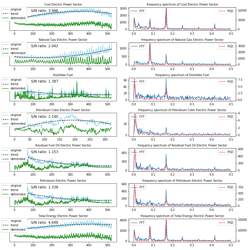
In the above figure we can see the time-series of the Carbon emissions dataset plotted for several types of energy and on the right side we can see the frequency spectrum. There are a few things to note here;
- we have used polyfit and poly1d for the estimation of the trend. These are popular methods in Python for polynomial curve-fitting and have the advantage that you can determine what the degree of the fit has to be, and what the parameters are of the fitted polynomial. For example, it is also possible to reconstruct the fitted curve with
y_fitted = z_fitted[0]*xvalues. If you expect your time-series to continue linearly, you can fit it with a degree of 1, if you expect it to rise or decrease quadratically you can fit it with higher orders.
As you can see, the trend in some of the energy types are better fitted with a higher order polynomial (degree 2). - Besides the Fourier transform (FFT) we have also calculated the Power Spectrum Density (PSD) and shown on the right.
As you can see there are several energy types which have the same frequency contents and seasonality in the beginning of the time-series as the end. This is true for Coal, Natural Gas and Total energy sectors.
And there are other energy types time-series looks very different over time, like the Residual Fuel Oil and Petroleum electric power sectors. This can have many reasons; maybe the global or US policy for using these types of energy sources changed over time, maybe there are some other reasons.
What I do know is that if I use the entire time-series to calculate the frequency spectrum and then use the entire frequency spectrum to extrapolate into the future, this extrapolation will probably be wrong. It is better to use the frequency spectrum generated from the last part of the time-series for extrapolation. That is why we set the fraction_signal parameter to 0.4.
|
1 2 3 4 5 6 7 8 9 10 11 12 13 14 15 16 17 18 19 20 21 22 23 24 25 26 27 28 29 30 31 32 33 |
N = 400 nrows=len(source_types) frac_harmonics = 0.3 fraction_signal = 0.6 max_peak = 0.4 ycol = 'Value' axtitle = 'desc {}' fig, axarr = plt.subplots(figsize=(18,2*nrows), ncols=3, nrows=nrows) for row_no, desc in enumerate(source_types): df_ = df_carbon[df_carbon['Description'] == desc] yvalues_full = df_[ycol].values xvalues_full = np.arange(len(yvalues_full)) yvalues_known = yvalues_full[:N] xvalues_known = np.arange(len(yvalues_known)) yvalues_future = yvalues_full[N:] xvalues_future = np.arange(N, len(xvalues_full)) N_extrapolation = len(yvalues_future) yvalues_detrended = plot_yvalues(axarr[row_no, 0], xvalues_full, yvalues_full, plot_original=True, polydeg=2) fft_x_, fft_y_ = plot_fft_psd(axarr[row_no, 1], yvalues_detrended, plot_psd=True, max_peak=max_peak) yvalues_predicted1 = reconstruct_from_fft(yvalues_known, extrapolate_with=N_extrapolation, fraction_signal=fraction_signal) yvalues_predicted2 = reconstruct_from_fft(yvalues_known, extrapolate_with=N_extrapolation, fraction_signal=fraction_signal, frac_harmonics=frac_harmonics) axarr[row_no,2].plot(xvalues_future, yvalues_future, label='true yvalues', linewidth=2) axarr[row_no,2].plot(xvalues_future, yvalues_predicted1, label='pred (all harmonics)') axarr[row_no,2].plot(xvalues_future, yvalues_predicted2, label='pred (30% harmonics)') title = axtitle.format(store) axarr[row_no,0].set_title('known time-series for {}'.format(title),fontsize=10) axarr[row_no,1].set_title('frequency spectrum of {}'.format(title),fontsize=10) axarr[row_no,2].set_title('predicted future for {}'.format(title),fontsize=10) axarr[row_no,2].set_yticks([]) axarr[row_no,2].legend(loc='upper left', bbox_to_anchor=(1.01, 1.078)) plt.tight_layout() plt.show() plt.close() |
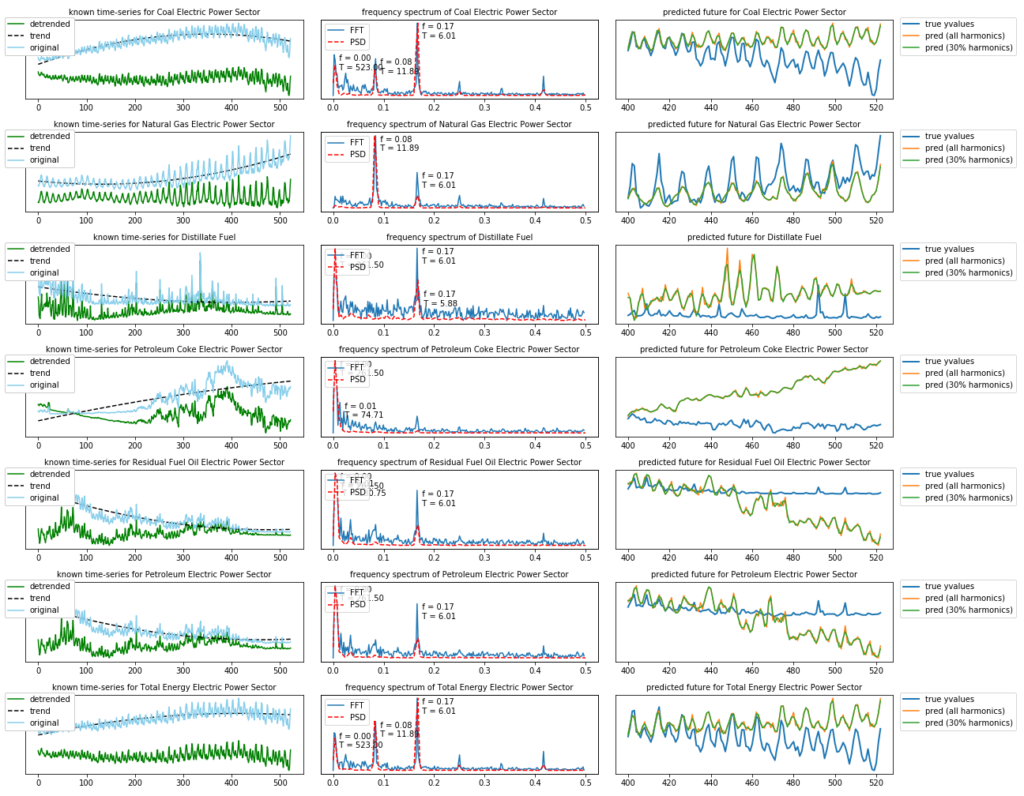
As we can see, depending on the energy source type, the time-series is less predictable for the future. That is also the reason why I have included this dataset for this analysis.
We can see that the first half of the time-series for “Petroleum Coke” almost does not have any seasonal components. The same can be said for the latter part of the “Residual Fuel Oil” and “Petroleum Electric” energy types. That is why forecasting these energy types into the future becomes more difficult.
The Fourier transform has zero resolution in the time-domain, i.e. it can not distinguish between the different parts of the time-domain. That is why it only works well for stationary time-series (who has the same frequency spectrum over all of its time-domain) and it does not work well for dynamic time-series (whose frequency contents change over time).
If you are dealing with a dynamic time-series it is better to use the Wavelet Transform.
5. Final Notes
The original goal of this blog-post was to explain a bit more in detail how the Fourier transform works and can be used to transform to and from the frequency spectrum. I did not intend to write so much about time-series forecasting / extrapolation into the future. But as I am curious by nature, I also wanted to find out how the FFT can be used for extrapolation and how accurate it is.
What I have found out during this process is that it is better to use standard software packages like Prophet for time-series forecasting. The main reason for this is that forecasting with the FFT is very elementary and lacks many of the handy features which have been built into Prophet. A simple example is that the FFT does not take into account whether a day is a weekday / weekend, holiday day, etc but Prophet does.
What I am trying to say is that the contents of the blog-post should be used for educational and experimental purposes and not to create business critical software (but if you do find a very good use for FFT forecasting please let me know).
In any case, the python code in this blog-post is also available in my Github repository.
2 gedachten over “Time-Series forecasting with Stochastic Signal Analysis techniques”
Great content, thank you! Just a small suggestion, could you please make the top bar a bit smaller, that would make your blog even more awsome!
One of the best bloggers on time series analysis.