Stochastic Signal Analysis is a field of science concerned with the processing, modification and analysis of (stochastic) signals.
Anyone with a background in Physics or Engineering knows to some degree about signal analysis techniques, what these technique are and how they can be used to analyze, model and classify signals.
Data Scientists coming from a different fields, like Computer Science or Statistics, might not be aware of the analytical power these techniques bring with them.
In this blog post, we will have a look at how we can use Stochastic Signal Analysis techniques, in combination with traditional Machine Learning Classifiers for accurate classification and modelling of time-series and signals.
At the end of the blog-post you should be able understand the various signal-processing techniques which can be used to retrieve features from signals and be able to classify ECG signals (and even identify a person by their ECG signal), predict seizures from EEG signals, classify and identify targets in radar signals, identify patients with neuropathy or myopathyetc from EMG signals by using the FFT, etc etc.
1. Basics of Signals
1.1 Signals vs Time-Series
You might often have come across the words time-series and signals describing datasets and it might not be clear what the exact difference between them is.
In a time-series dataset the to-be-predicted value (\(y\)) is a function of time (\(y = y(t)\)). Such a function can describe anything, from the value of bitcoin or a specific stock over time, to fish population over time. A signal is a more general version of this where the dependent variable \(y\) does not have to a function of time; it can be a function of spatial coordinates (\(y = y(x, y)\)), distance from the source ( \(y = y(r)\) ), etc etc.
Signals can come in many different forms and shapes: you can think of audio signals, pictures, video signals, geophysical signals (seismic data), sonar and radar data and medical signals (EEG, ECG, EMG).
- A picture can be seen as a signal which contains information about the brightness of the three colors (RGB) across the two spatial dimensions.
- Sonar signals give information about an acoustic pressure field as a function of time and the three spatial dimensions.
- Radar signals do the same thing for electromagnetic waves.
In essence, almost anything can be interpreted as a signal as long as it carries information within itself.
1.2 Discrete Time Signals
If you open up a text book on Signal Processing it will usually be divided into two parts: the continuous time-domain and the discrete-time domain.
The difference is that Continuous signals have an independent variable which is (as the name suggests) continuous in nature, i.e. it is present at each time-step within its domain. No matter how far you ‘zoom in’, you will have a value at that time step; at \(t = 0.1 s\), at \(t = 0.1435 s\), at \(t = 0.1435297 s\), etc etc.
Discrete-time signals are discrete and are only defined at specific time-steps. For example, if the period of a discrete signal is \(0.1 s\), it will be defined at \(t = 0.1 s\), \(t = 0.2 s\), \(t = 0.3 s\), etc … (but not at \(t = 0.143 s\)).
Most of the signals you come across in nature are analog (continuous); think of the electrical signals in your body, human speech, any other sound you hear, the amount of light measured during the day, barometric pressure, etc etc.
Whenever you want to digitize one of these analog signals in order to analyze and visualize it on a computer, it becomes discrete. Since we will only be concerning ourselves with digital signals in this blog-post, we will only look at the discrete version of the various stochastic signal analysis techniques.
Digitizing an analog signal is usually done by sampling it with a specific sampling rate. In Figure 1 we can see a signal sampled at different frequencies.
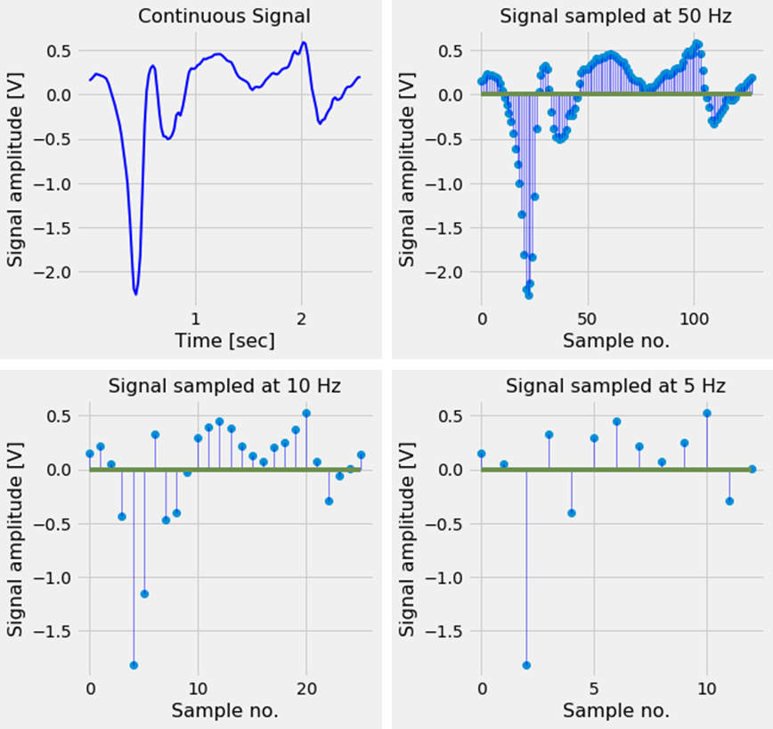 Figure 1. A continuous signal sampled at different frequencies. When the signal is sampled at a sampling rate which is too low, the digital signal no longer correctly represents the analog signal.
As we can see, it is important to choose a good sampling rate; if the sampling rate is chosen too low, the discrete signal will no longer contain the characteristics of the original analog signal and important features defining the signal are lost.
To be more specific, a signal is said to be under-sampled if the sampling rate is smaller than the Nyquist rate. The Nyquist rate is twice the highest frequency present in the signal. Under-sampling a signal can lead to effects like aliasing [2] and the wagon-wheel effect (see video). To prevent undersampling usually a frequency much higher than the Nyquist rate is chosen as the sampling frequency.
1.3 Periodic Signals and the Fourier Transform
If the signal contains a pattern, which repeats itself after a specific period of time, we call it an periodic signal. The time it takes for an periodic signal to repeat itself is called the period \(P\) (and the distance it travels in this period is called the wavelength \(\lambda\)).
The frequency \(f\) is the inverse of the Period; if a signal has a Period of \(1 s\), its frequency is \(1 Hz\), and if the period is \(10 s\), the frequency is \(0.1 Hz\).
The period, wavelength and frequency are related to each other via formula
- \(f = \frac{1}{P} = \frac{s}{\lambda}\) where \(s\) is the speed of sound.
2. Transformations between time- and frequency-domain (FFT, PSD, wavelet)
Fourier analysis is a field of study used to analyze the periodicity in (periodic) signals. If a signal contains components which are periodic in nature, Fourier analysis can be used to decompose this signal in its periodic components. Fourier analysis tells us at what the frequency of these periodical component are.
For example, if we measure your heart beat and at the time of measurement you have a heart rate of 60 beats / minute, the signal will have a frequency of \(1 Hz\) (Period of \(1 S\) = frequency of \(1 Hz\)). If you are doing at the same time, some repetitive task where you move your fingers every two seconds, the signal going to you hand will have a frequency of \(0.5 Hz\) (Period of \(2 S\) = frequency of \(0.5 Hz\)). An electrode placed on your arm, will measure the combination of these two signals. And a Fourier analysis performed on the combined signals, will show us a peak in the frequency spectrum at 0.5 Hz and one at 1 Hz.
So, two (or more) different signals (with different frequencies, amplitudes, etc) can be mixed together to form a new composite signal. The new signal then consists of all of its component signals.
The reverse is also true, every signal - no matter how complex it looks - can be decomposed into a sum of its simpler signals. These simpler signals are trigonometric functions (sine and cosine waves). This was discovered (in 1822) by Joseph Fourier and it is what Fourier analysis is about. The mathematical function which transform a signal from the time-domain to the frequency-domain is called the Fourier Transform, and the function which does the opposite is called the Inverse Fourier Transform.
If you want to know how the Fourier transform works, 3blue1brown’s beautifully animated explanation will hopefully give you more insight.
Below, we can see this in action. We have five sine-waves (blue signals) with amplitudes 4, 6, 8, 10 and 14 and frequencies 6.5, 5, 3, 1.5 and 1 Hz. By combining these signals we form a new composite signal (black). The Fourier Transform transforms this signal to the frequency-domain (red signal) and shows us at which frequencies the component signals oscillate.
1
2
3
4
5
6
7
8
9
10
11
12
13
14
15
16
17
18
19
20
21
22
23
24
25
26
27
28
29
30
31
32
33
34
35
36
37
38
39
40
41
42
43
44
45
46
47
from mpl_toolkits.mplot3d import Axes3D

t_n = 10
N = 1000
T = t_n / N
f_s = 1/T

x_value = np.linspace(0,t_n,N)
amplitudes = [4, 6, 8, 10, 14]
frequencies = [6.5, 5, 3, 1.5, 1]
y_values = [amplitudes[ii]*np.sin(2*np.pi*frequencies[ii]*x_value) for ii in range(0,len(amplitudes))]
composite_y_value = np.sum(y_values, axis=0)

f_values, fft_values = get_fft_values(composite_y_value, T, N, f_s)

colors = ['k', 'b', 'b', 'b', 'b', 'b', 'b', 'b', 'b']

fig = plt.figure(figsize=(8,8))
ax = fig.add_subplot(111, projection='3d')
ax.set_xlabel("\nTime [s]", fontsize=16)
ax.set_ylabel("\nFrequency [Hz]", fontsize=16)
ax.set_zlabel("\nAmplitude", fontsize=16)

y_values_ = [composite_y_value] + list(reversed(y_values))
frequencies = [1, 1.5, 3, 5, 6.5]

for ii in range(0,len(y_values_)):
    signal = y_values_[ii]
    color = colors[ii]
    length = signal.shape[0]
    x=np.linspace(0,10,1000)
    y=np.array([frequencies[ii]]*length)
    z=signal

    if ii == 0:
        linewidth = 4
    else:
        linewidth = 2
    ax.plot(list(x), list(y), zs=list(z), linewidth=linewidth, color=color)

    x=[10]*75
    y=f_values[:75]
    z = fft_values[:75]*3
    ax.plot(list(x), list(y), zs=list(z), linewidth=2, color='red')

    plt.tight_layout()
plt.show()
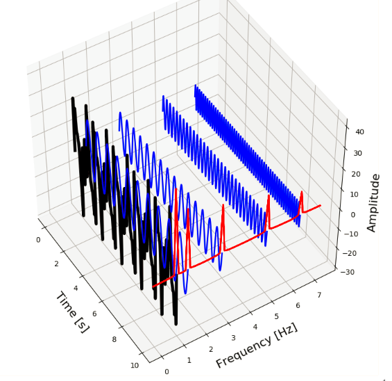 Figure 2. A signal (black) consisting of multiple component signals (blue) with different frequencies (red).
The Fast Fourier Transform (FFT) is an efficient algorithm for calculating the Discrete Fourier Transform (DFT) and is the de facto standard to calculate a Fourier Transform. It is present in almost any scientific computing libraries and packages, in every programming language.
Nowadays the Fourier transform is an indispensable mathematical tool used in almost every aspect of our daily lives. In the next section we will have a look at how we can use the FFT and other Stochastic Signal analysis techniques to classify time-series and signals.
2.1 The FFT in Python
In Python, the FFT of a signal can be calculate with the SciPy library. Below, we can see how we can use SciPy to calculate the FFT of the composite signal above, and retrieve the frequency values of its component signals.
1
2
3
4
5
6
7
8
9
10
11
12
13
14
15
16
17
18
19
20
from scipy.fftpack import fft

def get_fft_values(y_values, T, N, f_s):
    f_values = np.linspace(0.0, 1.0/(2.0*T), N//2)
    fft_values_ = fft(y_values)
    fft_values = 2.0/N * np.abs(fft_values_[0:N//2])
    return f_values, fft_values

t_n = 10
N = 1000
T = t_n / N
f_s = 1/T

f_values, fft_values = get_fft_values(composite_y_value, T, N, f_s)

plt.plot(f_values, fft_values, linestyle='-', color='blue')
plt.xlabel('Frequency [Hz]', fontsize=16)
plt.ylabel('Amplitude', fontsize=16)
plt.title("Frequency domain of the signal", fontsize=16)
plt.show()
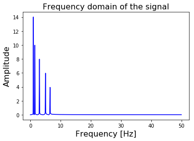 Figure 3. The FFT of our composite signal transforms it from the Time-domain to the Frequency Domain.
Since our signal is sampled at a rate \(f_s\) of \(100 Hz\), the FFT will return the frequency spectrum up to a frequency of \(f_s / 2 = 50 Hz\). The higher your sampling rate is, the higher the maximum frequency is FFT can calculate.
In the get_fft_values function above, the scipy.fftpack.fft function returns a vector of complex valued frequencies. Since they are complex valued, they will contain a real and an imaginary part. The real part of the complex value corresponds with the magnitude, and the imaginary part with the phase of the signal. Since we are only interested in the magnitude of the amplitudes, we use np.abs() to take the real part of the frequency spectrum.
The FFT of an input signal of N points, will return an vector of N points. The first half of this vector (N/2 points) contain the useful values of the frequency spectrum from 0 Hz up to the Nyquist frequency of \(f_s / 2\). The second half contains the complex conjugate and can be disregarded since it does not provide any useful information.
2.2 The PSD in Python
Closely related to the Fourier Transform is the concept of Power Spectral Density.
Similar to the FFT, it describes the frequency spectrum of a signal. But in addition to the FFT it also takes the power distribution at each frequency (bin) into account. Generally speaking the locations of the peaks in the frequency spectrum will be the same as in the FFT-case, but the height and width of the peaks will differ. The surface below the peaks corresponds with the power distribution at that frequency.
Calculation of the Power Spectral density is a bit easier, since SciPy contain a function which not only return a vector of amplitudes, but also a vector containing the tick-values of the frequency-axis.
1
2
3
4
5
6
7
8
9
10
11
12
13
14
15
16
17
from scipy.signal import welch

def get_psd_values(y_values, T, N, f_s):
    f_values, psd_values = welch(y_values, fs=f_s)
    return f_values, psd_values

t_n = 10
N = 1000
T = t_n / N
f_s = 1/T

f_values, psd_values = get_psd_values(composite_y_value, T, N, f_s)

plt.plot(f_values, psd_values, linestyle='-', color='blue')
plt.xlabel('Frequency [Hz]')
plt.ylabel('PSD [V**2 / Hz]')
plt.show()
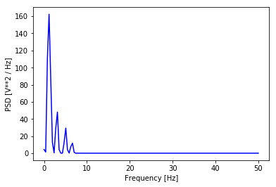 Figure 4. The PSD of our composite signal.
2.3 Calculating the auto-correlation in Python
The auto-correlation function calculates the correlation of a signal with a time-delayed version of itself. The idea behind it is that if a signal contain a pattern which repeats itself after a time-period of \(\tau\) seconds, there will be a high correlation between the signal and a \(\tau\) sec delayed version of the signal.
Unfortunately there is no standard function to calculate the auto-correlation of a function in SciPy. But we can make one ourselves using the correlate() function of numpy. Our function returns the correlation value, as a function of the time-delay \(\tau\). Naturally, this time-delay can not be more than the full length of the signal (which is in our case 2.56 sec).
1
2
3
4
5
6
7
8
9
10
11
12
13
14
15
16
17
18
19
20
def autocorr(x):
    result = np.correlate(x, x, mode='full')
    return result[len(result)//2:]

def get_autocorr_values(y_values, T, N, f_s):
    autocorr_values = autocorr(y_values)
    x_values = np.array([T * jj for jj in range(0, N)])
    return x_values, autocorr_values

t_n = 10
N = 1000
T = t_n / N
f_s = 1/T

t_values, autocorr_values = get_autocorr_values(composite_y_value, T, N, f_s)

plt.plot(t_values, autocorr_values, linestyle='-', color='blue')
plt.xlabel('time delay [s]')
plt.ylabel('Autocorrelation amplitude')
plt.show()
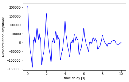 Figure 5. The autocorrelation of our composite function.
Converting the values of the auto-correlation peaks from the time-domain to the frequency domain should result in the same peaks as the ones calculated by the FFT. The frequency of a signal thus can be found with the auto-correlation as well as with the FFT. However, because it is more precise, the FFT is almost always used for frequency detection.
Fun fact: the auto-correlation and the PSD are Fourier Transform pairs, i.e. the PSD can be calculated by taking the FFT of the auto-correlation function, and the auto-correlation can be calculated by taking the Inverse Fourier Transform of the PSD function.
2.4 The Wavelet Transform
One transform which we have not mentioned here is the Wavelet transform. It transform a signal into its frequency domain, just like the Fourier Transform.
The difference is: the Fourier Transform has a very high resolution in the frequency domain, and zero resolution in the time domain; we know at which frequencies the signal oscillates, but not at which time these oscillations occur. The output of a Wavelet transform hash a high resolution in the frequency domain and also in the time domain; it maintains information about the time-domain.
The wavelet transform is better suited for analyzing signals with a dynamic frequency spectrum, i.e. the frequency spectrum changes over time, or has a component with a different frequency localized in time (the frequency changes abruptly for a short period of time).
Lets have a look at how to use the wavelet transform in Python in the next blog-post. For the ones who can not wait to get started with it, here are some examples of applications using the wavelet transform.
3. Statistical parameter estimation and feature extraction
We have seen three different ways to calculate characteristics of signals using the FFT, PSD and the autocorrelation function. These functions transform a signal from the time-domain to the frequency-domain and give us its frequency spectrum.
After we have transformed a signal to the frequency-domain, we can extract features from each of these transformed signals and use these features as input in standard classifiers like Random Forest, Logistic Regression, Gradient Boosting or Support Vector Machines.
Which features can we extract from these transformations? A good first step is the value of the frequencies at which oscillations occur and the corresponding amplitudes. In other words; the x and y-position of the peaks in the frequency spectrum. SciPy contains some methods to find the relative maxima (argrelmax) and minima (argrelmin) in data, but I found the peak detection method of Marcos Duarte much simpler and easier to use.
Armed with this peak-finding function, we can calculate the FFT, PSD and the auto-correlation of each signal and use the x and y coordinates of the peaks as input for our classifier. This is illustrated in Figure 6.
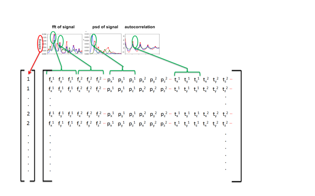 Figure 6. The location of the peaks in the FFT, PSD and autocorrelation can be used as features for our classifier.
3.1 Example dataset: Classification of human activity
Lets have a look at how we can classify the signals in the Human Activity Recognition Using Smartphones Data Set. This dataset contains measurements done by 30 people between the ages of 19 to 48. The measurements are done with a smartphone placed on the waist while doing one of the following six activities:
- walking,
- walking upstairs,
- walking downstairs,
- sitting,
- standing or
- laying.
The measurements are done at a constant rate of \(50 Hz\). After filtering out the noise, the signals are cut in fixed-width windows of 2.56 sec with an overlap of 1.28 sec. Each signal will therefore have 50 x 2.56 = 128 samples in total. This is illustrated in Figure 7a.
The smartphone measures three-axial linear body acceleration, three-axial linear total acceleration and three-axial angular velocity. So per measurement, the total signal consists of nine components (see Figure 7b).
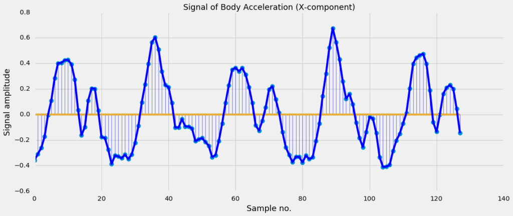 Figure 7a. A plot of the first components (body acceleration measured in the x-direction) of the signal.
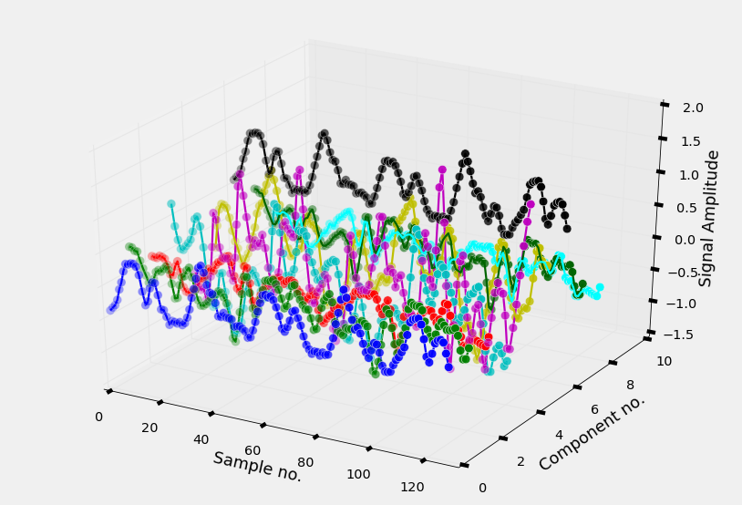 Figure 7b. A 3D plot of the nine different components of a signal.
The dataset is already splitted into a training and a test part, so we can immediately load the signals into an numpy ndarray.
1
2
3
4
5
6
7
8
9
10
11
12
13
14
15
16
17
18
19
20
21
22
23
24
25
26
27
28
29
30
31
32
33
34
35
36
37
38
39
40
41
def read_signals(filename):
    with open(filename, 'r') as fp:
        data = fp.read().splitlines()
        data = map(lambda x: x.rstrip().lstrip().split(), data)
        data = [list(map(float, line)) for line in data]
        data = np.array(data, dtype=np.float32)
    return data

def read_labels(filename):
    with open(filename, 'r') as fp:
        activities = fp.read().splitlines()
        activities = list(map(int, activities))
    return np.array(activities)

INPUT_FOLDER_TRAIN = './UCI_HAR/train/InertialSignals/'
INPUT_FOLDER_TEST = './UCI_HAR/test/InertialSignals/'

INPUT_FILES_TRAIN = ['body_acc_x_train.txt', 'body_acc_y_train.txt', 'body_acc_z_train.txt',
                     'body_gyro_x_train.txt', 'body_gyro_y_train.txt', 'body_gyro_z_train.txt',
                     'total_acc_x_train.txt', 'total_acc_y_train.txt', 'total_acc_z_train.txt']

INPUT_FILES_TEST = ['body_acc_x_test.txt', 'body_acc_y_test.txt', 'body_acc_z_test.txt',
                     'body_gyro_x_test.txt', 'body_gyro_y_test.txt', 'body_gyro_z_test.txt',
                     'total_acc_x_test.txt', 'total_acc_y_test.txt', 'total_acc_z_test.txt']

train_signals, test_signals = [], []

for input_file in INPUT_FILES_TRAIN:
    signal = read_signals(INPUT_FOLDER_TRAIN + input_file)
    train_signals.append(signal)
train_signals = np.transpose(np.array(train_signals), (1, 2, 0))

for input_file in INPUT_FILES_TEST:
    signal = read_signals(INPUT_FOLDER_TEST + input_file)
    test_signals.append(signal)
test_signals = np.transpose(np.array(test_signals), (1, 2, 0))

LABELFILE_TRAIN = './UCI_HAR/train/y_train.txt'
LABELFILE_TEST = './UCI_HAR/test/y_test.txt'
train_labels = read_labels(LABELFILE_TRAIN)
test_labels = read_labels(LABELFILE_TEST)
We have loaded the training set into a ndarray of size (7352, 128, 9) and the test set into a ndarray of size (2947, 128, 9). As you can guess from the dimensions, the number of signals in the training set is 7352 and the number of signals in the test set is 2947. And each signal in the training and test set has a length of 128 samples and 9 different components.
Below, we will visualize the signal itself with its nine components, the FFT, the PSD and auto-correlation of the components, together with the peaks present in each of the three transformations.
1
2
3
4
5
6
7
8
9
10
11
12
13
14
15
16
17
18
19
20
21
22
23
24
25
26
27
28
29
30
31
32
33
34
35
36
37
38
39
40
41
42
43
44
45
46
47
48
49
50
51
52
53
54
55
56
57
58
59
60
61
62
63
64
65
66
import numpy as np
import matplotlib.pyplot as plt

def get_values(y_values, T, N, f_s):
    y_values = y_values
    x_values = [sample_rate * kk for kk in range(0,len(y_values))]
    return x_values, y_values

####

labels = ['x-component', 'y-component', 'z-component']
colors = ['r', 'g', 'b']
suptitle = "Different signals for the activity: {}"

xlabels = ['Time [sec]', 'Freq [Hz]', 'Freq [Hz]', 'Time lag [s]']
ylabel = 'Amplitude'
axtitles = [['Acceleration', 'Gyro', 'Total acceleration'],
            ['FFT acc', 'FFT gyro', 'FFT total acc'],
            ['PSD acc', 'PSD gyro', 'PSD total acc'],
            ['Autocorr acc', 'Autocorr gyro', 'Autocorr total acc']
           ]

list_functions = [get_values, get_fft_values, get_psd_values, get_autocorr_values]

N = 128
f_s = 50
t_n = 2.56
T = t_n / N

signal_no = 0
signals = train_signals[signal_no, :, :]
label = train_labels[signal_no]
activity_name = activities_description[label]

f, axarr = plt.subplots(nrows=4, ncols=3, figsize=(12,12))
f.suptitle(suptitle.format(activity_name), fontsize=16)

for row_no in range(0,4):
    for comp_no in range(0,9):
        col_no = comp_no // 3
        plot_no = comp_no % 3
        color = colors[plot_no]
        label = labels[plot_no]

        axtitle  = axtitles[row_no][col_no]
        xlabel = xlabels[row_no]
        value_retriever = list_functions[row_no]

        ax = axarr[row_no, col_no]
        ax.set_title(axtitle, fontsize=16)
        ax.set_xlabel(xlabel, fontsize=16)
        if col_no == 0:
            ax.set_ylabel(ylabel, fontsize=16)

        signal_component = signals[:, comp_no]
        x_values, y_values = value_retriever(signal_component, T, N, f_s)
        ax.plot(x_values, y_values, linestyle='-', color=color, label=label)
        if row_no > 0:
            max_peak_height = 0.1 * np.nanmax(y_values)
            indices_peaks = detect_peaks(y_values, mph=max_peak_height)
            ax.scatter(x_values[indices_peaks], y_values[indices_peaks], c=color, marker='*', s=60)
        if col_no == 2:
            ax.legend(loc='center left', bbox_to_anchor=(1, 0.5))
plt.tight_layout()
plt.subplots_adjust(top=0.90, hspace=0.6)
plt.show()
That is a lot of code! But if you strip away the parts of the code to give the plot a nice layout, you can see it basically consists of two for loops which apply the different transformations to the nine components of the signal and subsequently finds the peaks in the resulting frequency spectrum. The transformation is plotted with a line-plot and the found peaks are plot with a scatter-plot.
The result can be seen in Figure 8.
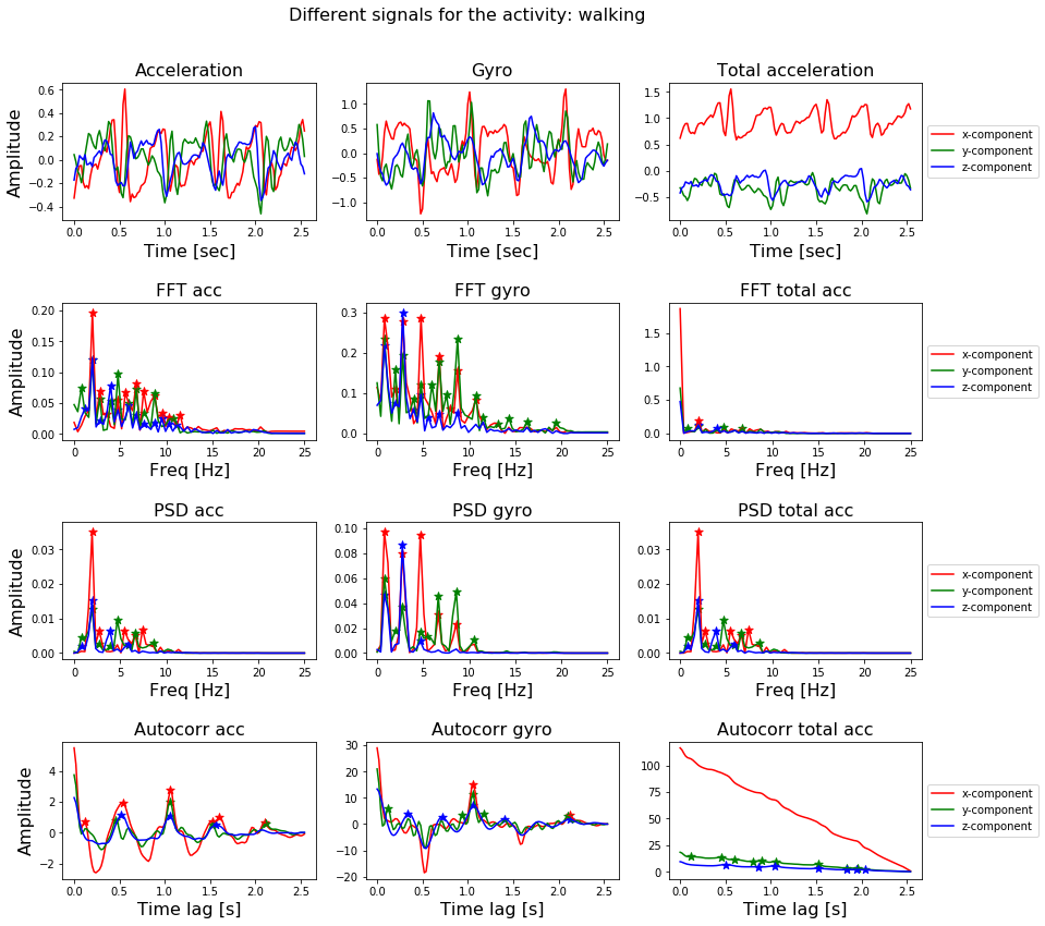 Figure 8. The nine different components of a signal, together with the FFT, PSD and autocorrelation function applied to these components.
3.2 Extracting features from all signals in the training and test set
In Figure 8, we have already shown how to extract features from a signal: transform a signal by means of the FFT, PSD or autocorrelation function and locate the peaks in the transformation with the peak-finding function.
We have already seen how to do that for one signal, so now simply need to iterate through all signals in the dataset.
1
2
3
4
5
6
7
8
9
10
11
12
13
14
15
16
17
18
19
20
21
22
23
24
25
26
27
28
29
30
31
32
33
34
35
36
37
def get_first_n_peaks(x,y,no_peaks=5):
    x_, y_ = list(x), list(y)
    if len(x_) >= no_peaks:
        return x_[:no_peaks], y_[:no_peaks]
    else:
        missing_no_peaks = no_peaks-len(x_)
        return x_ + [0]*missing_no_peaks, y_ + [0]*missing_no_peaks

def get_features(x_values, y_values, mph):
    indices_peaks = detect_peaks(y_values, mph=mph)
    peaks_x, peaks_y = get_first_n_peaks(x_values[indices_peaks], y_values[indices_peaks])
    return peaks_x + peaks_y

def extract_features_labels(dataset, labels, T, N, f_s, denominator):
    percentile = 5
    list_of_features = []
    list_of_labels = []
    for signal_no in range(0, len(dataset)):
        features = []
        list_of_labels.append(labels[signal_no])
        for signal_comp in range(0,dataset.shape[2]):
            signal = dataset[signal_no, :, signal_comp]

            signal_min = np.nanpercentile(signal, percentile)
            signal_max = np.nanpercentile(signal, 100-percentile)
            #ijk = (100 - 2*percentile)/10
            mph = signal_min + (signal_max - signal_min)/denominator

            features += get_features(*get_psd_values(signal, T, N, f_s), mph)
            features += get_features(*get_fft_values(signal, T, N, f_s), mph)
            features += get_features(*get_autocorr_values(signal, T, N, f_s), mph)
        list_of_features.append(features)
    return np.array(list_of_features), np.array(list_of_labels)

denominator = 10
X_train, Y_train = extract_features_labels(train_signals, train_labels, T, N, f_s, denominator)
X_test, Y_test = extract_features_labels(test_signals, test_labels, T, N, f_s, denominator)
This process results in a matrix containing the features of the training set, and a matrix containing the features of the test set. The number rows of these matrices should be equal to the number of signals in each set (7352 and 2947).
The number of columns in each matrix depend on depends on your choice of features. Each signal has nine components, and for each component you can calculate either just the FFT or all three of the transformations. For each transformation you can decide to look at the first n peaks in the signal. And for each peak you can decide to take only the x value, or both the x and y values. In the example above, we have taken the x and y values of the first 5 peaks of each transform, so we have 270 columns (935*2) in total.
4. Classification with (traditional) Scikit-learn classifiers
After constructing the matrices for the training and the test set, together with a list of the correct labels, we can use the scikit-learn package to construct a classifier.
1
2
3
4
5
6
7
8
9
from sklearn.ensemble import RandomForestClassifier
from sklearn.metrics import classification_report

clf = RandomForestClassifier(n_estimators=1000)
clf.fit(X_train, Y_train)
print("Accuracy on training set is : {}".format(clf.score(X_train, Y_train)))
print("Accuracy on test set is : {}".format(clf.score(X_test, Y_test)))
Y_test_pred = clf.predict(X_test)
print(classification_report(Y_test, Y_test_pred))
1
2
3
4
5
6
7
8
9
10
---Accuracy on training set is : 1.0
---Accuracy on test set is : 0.9097387173396675
--- 1       0.96      0.98      0.97       496
--- 2       0.94      0.95      0.95       471
--- 3       0.94      0.90      0.92       420
--- 4       0.84      0.82      0.83       491
--- 5       0.86      0.96      0.90       532
--- 6       0.94      0.85      0.89       537
---
--- avg / total      0.91      0.91      0.91      2947
As you can see, we were able to classify these signals with quite a high accuracy. The accuracy of the training set is about 1 and the accuracy on the test set is about 0.91.
To achieve this accuracy we did not even have to break a sweat. The feature selection was done fully automatic; for each transformation we selected the x and y component of the first five peaks (or use the default value of zero).
It is understandable that some of the 270 features will be more informative than other ones. It could be that some transformations of some components do not have five peaks, or that the frequency value of the peaks is more informative than the amplitude value, or that the FFT is always more informative than the auto-correlation.
The accuracy will increase even more if we actively select the features, transformations and components which are important for classification. Maybe we can even choose a different classifier or play around with its parameter values (hyperparameter optimization) to achieve a higher accuracy.
5. Finals Words
The field of stochastic signal analysis provides us with a set of powerful tools which can be used to analyze, model and classify time-series and signals. I hope this blog-post has provided you with some information on how to use these techniques.
If you found this blog useful feel free to share it with other people and with your fellow Data Scientists. If you think something is missing feel free to leave a comment below!
Did you notice we did not use a Recurrent Neural Net ? :-) What kind of accuracy can you achieve on this dataset with a RNN?
The code is also available as a Jupyter notebook on my GitHub account.